Hello crafters
Continuing with our rule of three, this month we are talking about colours on our pages.
Rule of Three # 2 – Three colours
While most of us love bright colourful pages, sometimes we can get a little carried away with colour, and end up with a page that just doesn’t work well, or looks too busy, and that can distract from our photos, which is the reason we scrapbook, to preserve memories….. as well as enjoying the creative experience.
When designing your pages you want to remember that a colour palette works great when it’s a set of 3 colours The main colour, a secondary colour and an accent color.
Please bear in mind this is a guideline. When using a brightly coloured patterned paper, try and choose your secondary colour that complements the main colour in your patterned paper, and your accent colour should contrast with the rest of the page’s colour scheme.
This is where a colour wheel can be very helpful

Of course, the first place to start is looking at your photos and deciding what colours will complement them, you don’t want your colours to out-shine or clash with your photos, and once you have your base colours pick the colour wheel can help you pick an accent colour.
Also, neutrals generally don’t count in the rule of threes. Neutrals blend and can add definition rather than stand out as an additional colour. For example on a light colour page, a black border around layers and/or photos will add an extra layer of definition to your page.
Of course, if you are creating with Black and White, then this of course doesn’t apply, and your accent colour can be whatever you choose to add a ‘pop’ to your page.
Types of Color Schemes
- Monochromatic – The use of one colour or shades of one colour.
- Complementary – These colours are directly opposite each other on the colour wheel. When these colours are used together, they create vibrancy. Red/green and blue/orange are examples of complementary colours.
- Triadic – These colours are at an equal distance from each other on the colour wheel. Purple, green and orange are an example. These colours create a high contrast on a project, so you may want to adjust their lightness or darkness when you use them.
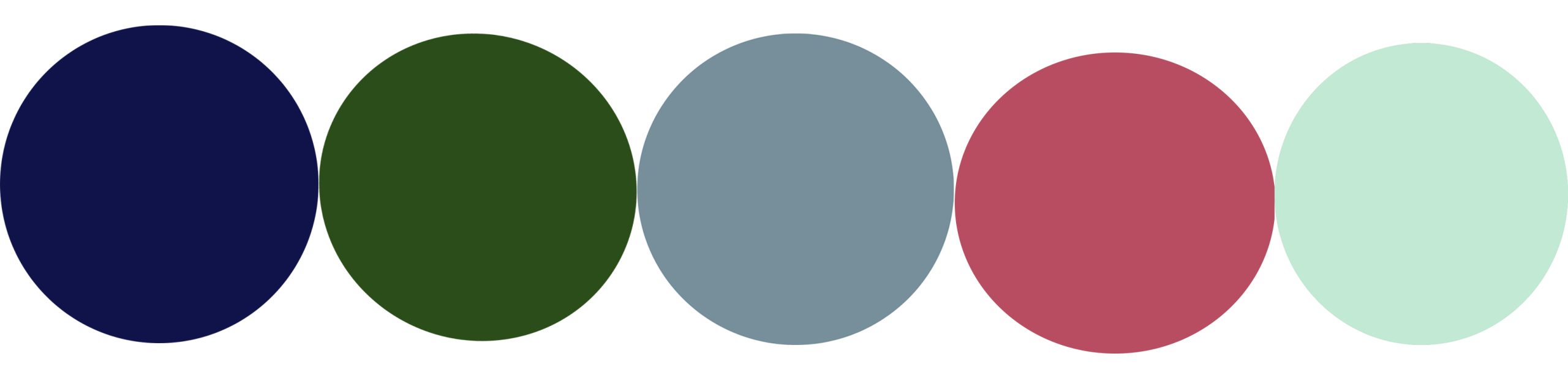
Here’s an example of what I mean… If I were about to scrap this photo of my son and sister, I think I would choose a darkish green base to enhance the “garden’ feel of the photo.

This would be the colour pallet I would choose the rest from… it would depend on my patterned paper, but pink/rose is a good accent colour for green, and it just happens my sister has pink in her dress, so it works well with the photo too.
Don’t forget, a BIG part is personal taste too, but these basic colour guides can help you make sure your pages are cohesive and pleasing to look at.
Happy scrapping
Donna


0 Comments